
Laithwaites Wines
Identity
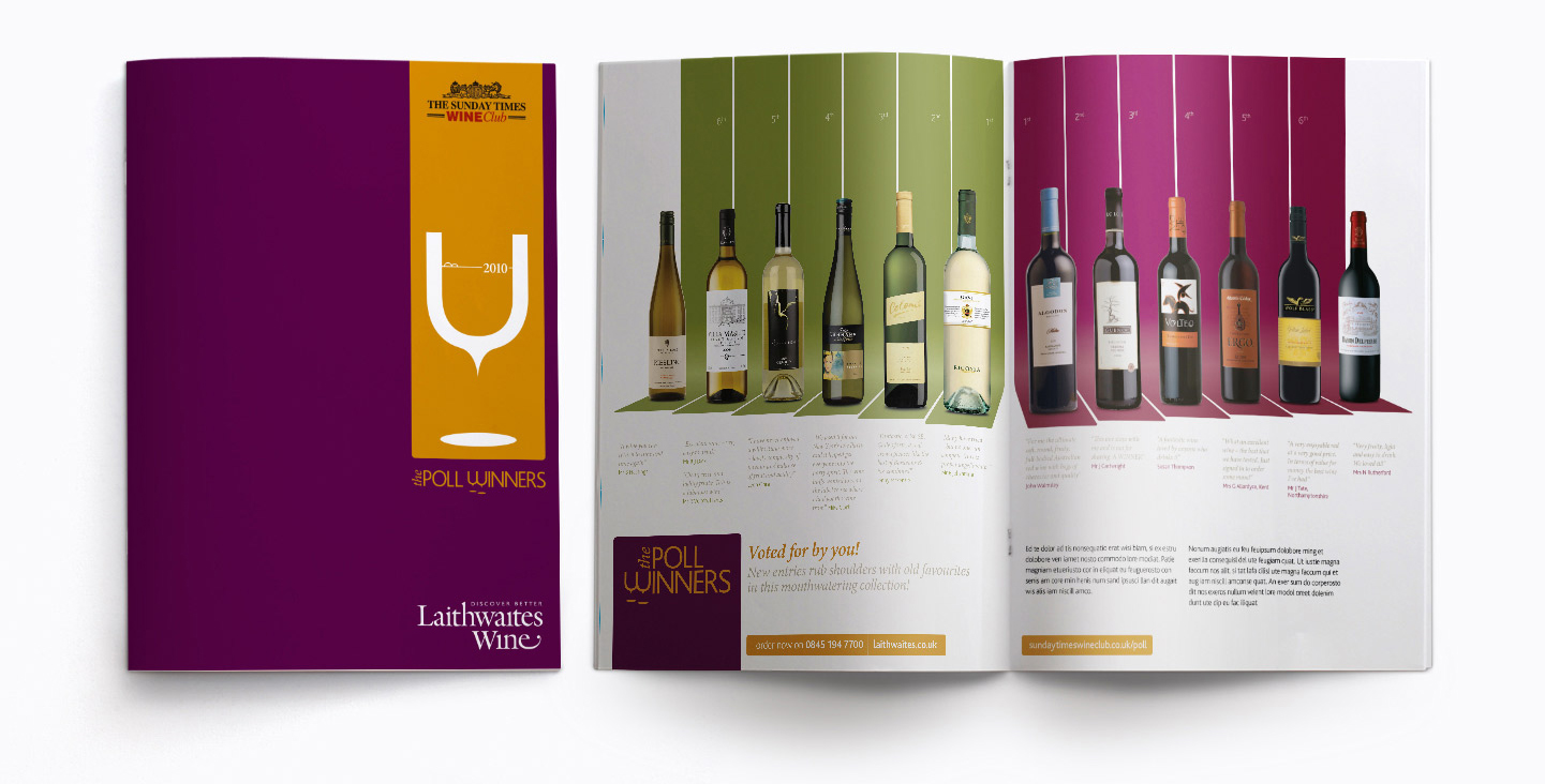
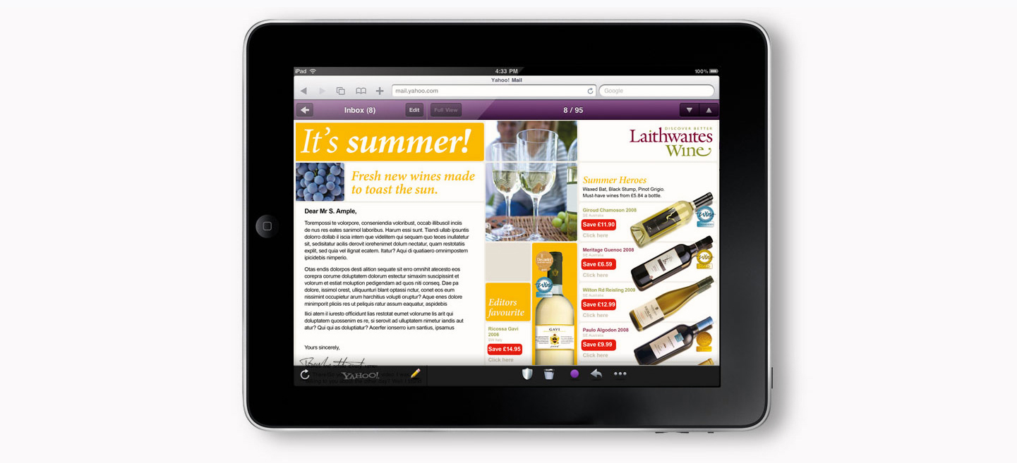
A cluttered and dated visual personality had harmed their brand positioning as the UK's leading independent wine merchant. The brief was to modernise and simplify their visual identity, while keeping their logo and two core colours.
A clean graphic approach based on the structure of grapes helped breathe fresh life into the their visual identity.
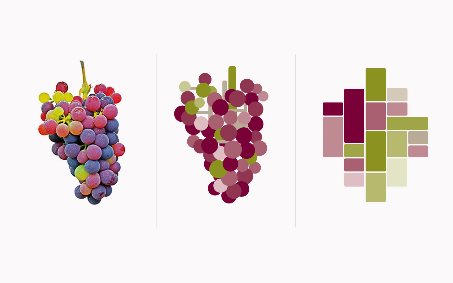 The main ingredient in wine provided the inspiration for the modular style.
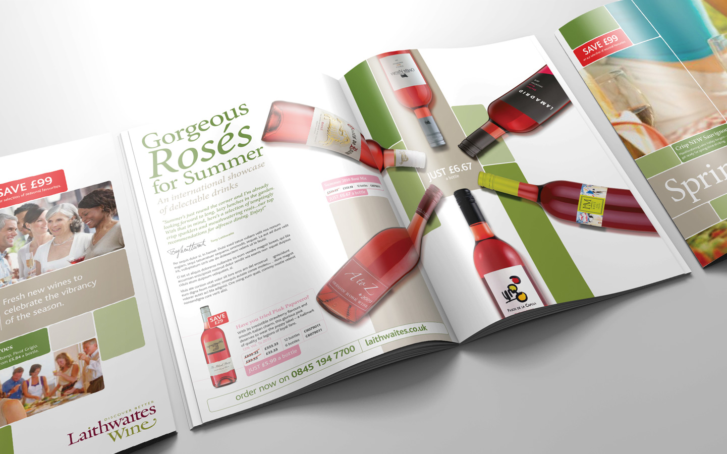
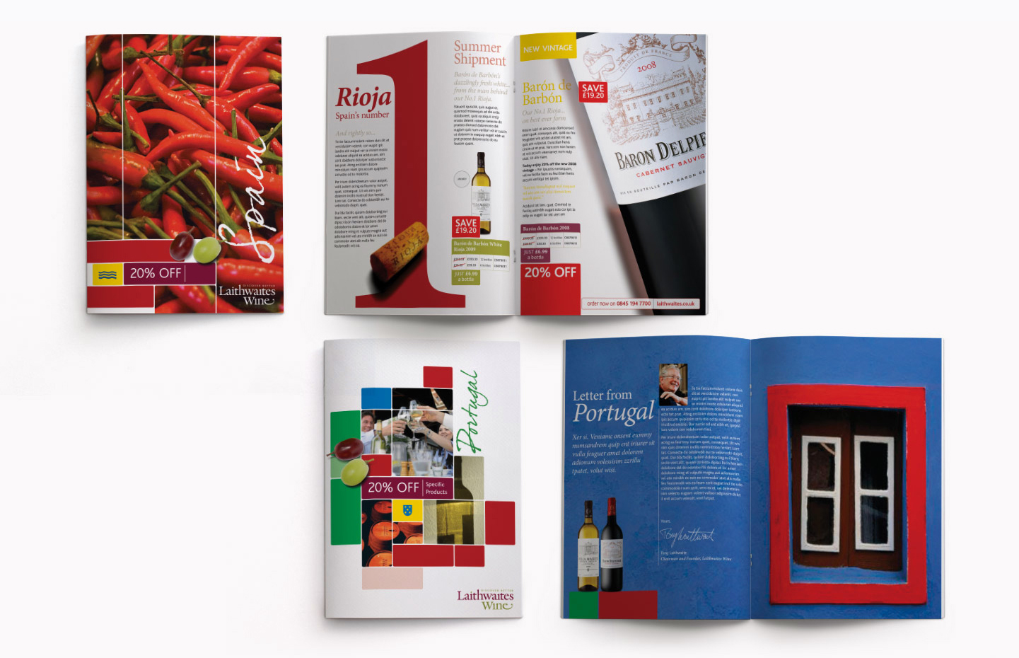
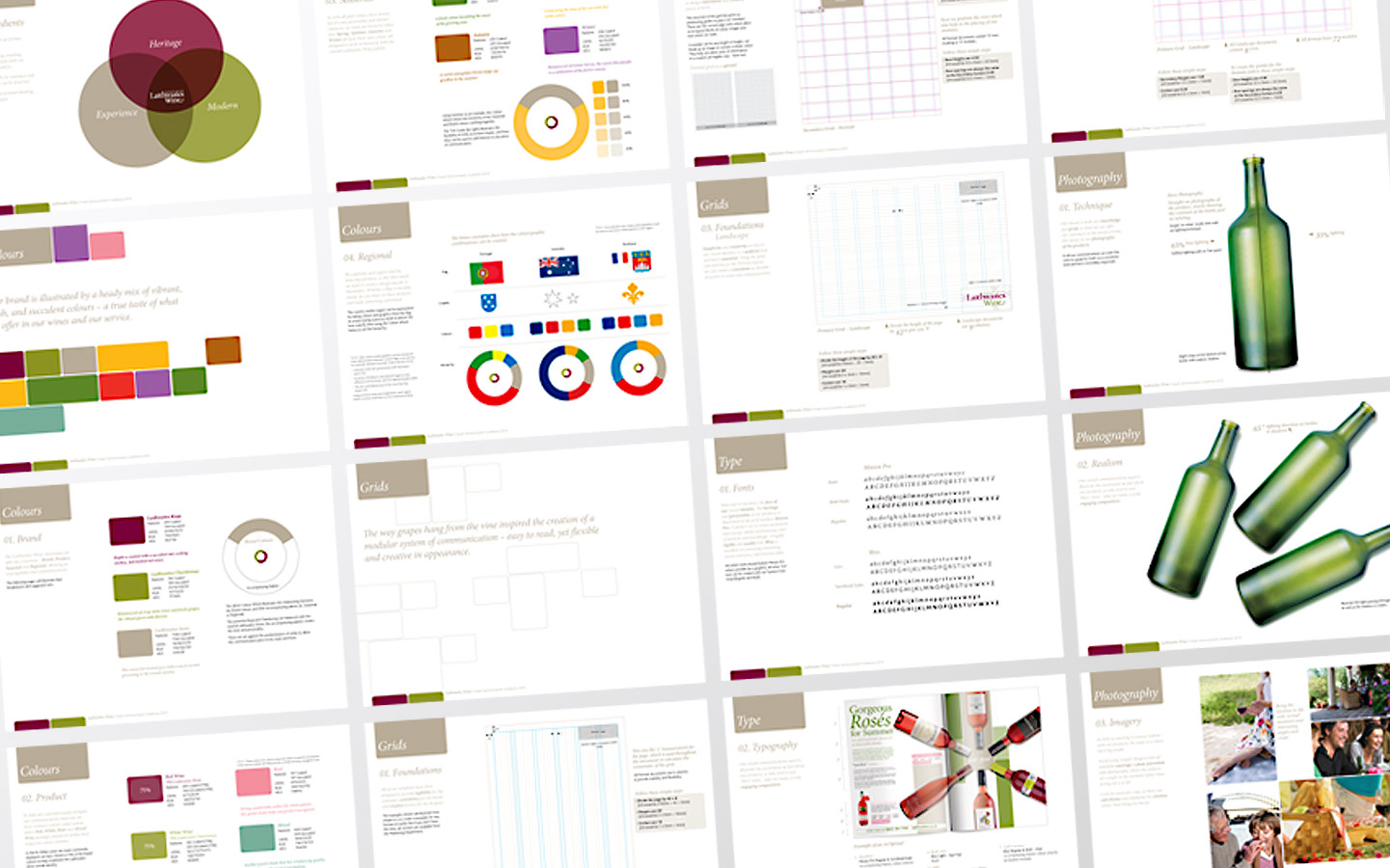 Specific areas were easily defined by the modular system, providing a sense of freedom when approaching layouts.
 The dynamic nature of the visual language was showcased in a communication toolkit.


© Neil Thomas
